
2. Data Visualization
2.1. Introduction
Why should you care about Data Visualization? Scientists have to report their work to demonstrate their arguments as a research paper, poster presentation, a talk, client reports, and vulgarisation. In this sense, it is a requirement to make clear*, attractive, and convincing data visualization. They play a central part in their communication and often carry the weight of an argumentation. However, it is not only a matter of visuals. The Story behind it is as much important as the visualization.
Before digging further into the concepts behind Data Visualization, it is important to differentiate between Good, Ugly, Bad, and Wrong Figures. An Ugly figure is clear and informative, but lack Aesthetic. A Bad figure is unclear, confusing, or complicated and present Perception issues. A Wrong figure has Mathematical, or Objectivity issues. Finally, a Good figure does not present any of the issues mentioned.
import numpy as np
import matplotlib.pyplot as plt
plt.ion()
plt.style.use('fivethirtyeight')

labels = ["A", "B", "C"]
data = np.array([3, 5, 4])

fig = plt.figure(figsize=(8, 8), facecolor="white")
ax1, ax2, ax3, ax4 = [fig.add_subplot(2, 2, i + 1) for i in range(4)]

ax1.bar(range(len(data)), data, tick_label=labels)
ax1.grid(axis='x')
ax1.set_ylabel("value")
ax1.title.set_text("Good")

ax2.bar(range(len(data)), data, tick_label=labels, color=["#B3D300", "#008FD5", "#6500D1"])
ax2.grid(linewidth=3, color="k")
ax2.grid(axis='x')
ax2.set_ylabel("value")
ax2.title.set_text("Ugly")

ax4.bar(range(len(data)), data, tick_label=labels)
ax4.grid()
ax4.set_yticks(())
ax4.title.set_text("Wrong")

ax3.title.set_text("Bad")
ax3.set_axis_off()

ax31, ax32, ax33 = [fig.add_subplot(2, 6, 7 + i) for i in range(3)]
ax31.bar(range(1), data[0], tick_label=labels[0])
ax31.set_ylabel("value")
ax32.bar(range(1), data[1], tick_label=labels[1])
ax32.set_ylim(0, 5)
ax33.bar(range(1), data[2], tick_label=labels[2])

fig.subplots_adjust(hspace=0.40, wspace=0.40)
fig.canvas.draw()
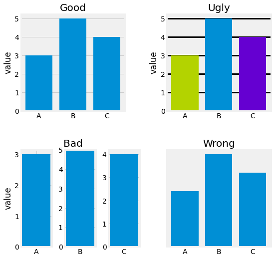
Fig. 2.1 Good vs. Ugly vs. Bad vs. Wrong example figures. The Ugly figure exhibits highly saturated colors, the colors do not bring any supplemental information, and the grid lines are too heavy on the eye. This is not supposed to be a focal point. The Bad figure is quite hard to read and present perception issues. The axes are not aligned in terms of value. The Wrong figure presents objectivity issues as the scale is not presented, and the nature of the data is not explained.
2.2. Visualizations
2.2.1. Data and Aesthetics
2.2.1.1. Data Types
Before even talking about what kind of aesthetics can be used when creating figures, it is important to understand the type of data you are working with. There are two main kinds of data: Qualitiative and Quantitative. Qualitiative data represents characteristics, descriptors that cannot be measured objectively such as color, smell, texture. Quantitative data can be measured and is either discrete, integers, or continuous, floating numerals.
2.2.1.2. Aesthetics
Even if they seem quite different at first glance, every type of graph has the same elements of language. Those elements are called Aesthetics. Each data value needs to be mapped with only one aesthetic. When this is not the case, data visualization can lead to ambiguities.
import numpy as np
import matplotlib.pyplot as plt
plt.ion()
plt.style.use('fivethirtyeight')

fig = plt.figure(figsize=(8, 8), facecolor="white")

ax = fig.add_subplot(6, 1, 1)
ax.scatter([0, 1, -1], [2, -2, 6])
ax.grid()
ax.set_axis_off()
ax.title.set_text("Position")

ax = fig.add_subplot(6, 1, 2)
for i, marker in enumerate(["o", "+", "x", "s", "v"]):
    ax.scatter([i,], [0,], marker=marker, s=500, color="#008FD5")
ax.set_ylim(-0.5, 0.5)
ax.grid()
ax.set_axis_off()
ax.title.set_text("Shape")

ax = fig.add_subplot(6, 1, 3)
for i, size in enumerate([500, 250, 125, 50, 25]):
    ax.scatter([i,], [0,], s=size, color="#008FD5")
ax.set_ylim(-0.5, 0.5)
ax.grid()
ax.set_axis_off()
ax.title.set_text("Size")

ax = fig.add_subplot(6, 1, 4)
for i in range(5):
    ax.scatter([i,], [0,], s=500)
ax.set_ylim(-0.5, 0.5)
ax.grid()
ax.set_axis_off()
ax.title.set_text("Color")

ax = fig.add_subplot(6, 1, 5)
for i, width in enumerate([20, 10, 5]):
    ax.plot(np.arange(0, 1, 0.1), [-i * 2,] * 10, linewidth=width, color="#008FD5")
ax.set_ylim(-6, 0.5)
ax.grid()
ax.set_axis_off()
ax.title.set_text("Line Width")

ax = fig.add_subplot(6, 1, 6)
for i, ltype in enumerate(["-", "--", "-.", ":"]):
    ax.plot(np.arange(0, 1, 0.1), [-i,] * 10, linestyle=ltype, linewidth=width, color="#008FD5")
ax.set_ylim(-4, 0.5)
ax.grid()
ax.set_axis_off()
ax.title.set_text("Line Type")

fig.subplots_adjust(hspace=0.40, wspace=0.40)
fig.canvas.draw()
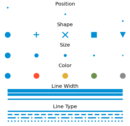
Fig. 2.2 Aesthetics for data visualization.
2.2.2. Visualization Types
Data points can be visualized in many ways. This section lists the visualization types with their corresponding data types they are used for.
Data Type |
Visualization Types |
|---|---|
Correlation |
Scatterplot, Bubble plot, Heatmap, Correlogram |
Evolution |
Line plot, Area plot, Stacked Densities, Parallel Set |
Proportion |
Tree plot, Stacked Densities |
Ranking |
Bar plot (vertical and horizontal), Spider |
Distribution |
Vilon, Density, Histogram |
Uncertainty |
Half Eyes, Confidence Bands |
Maps |
Map, Choropleth map, Connection Map, Buble Map |
Flow |
Chord Diagram, Graph Network, Parallel Set |
2.3. Design Principles
This section discusses the fundamental principles of data visualization: Data-ink Ratio and Storytelling.
2.3.1. Minimalism and Proportional Ink
Data Visualization must encourage accessibility first, visually and contextually. Minimalism for visualization is one way to achieve such a goal and has been formulated as the Data-Ink Ratio. It represents the ink ratio used for representing the data against the total ink used to print the entire graphic. The closer it is to 1, the less distracting the visualization is.
Tufte has provided five laws for Data-ink:
Above all else, show the data
Maximize data-ink ratio
Erase non-data-ink
Revise and edit
import numpy as np
import matplotlib.pyplot as plt
plt.ion()
plt.style.use('fivethirtyeight')

fig = plt.figure(figsize=(8, 8), facecolor="white")
ax1, ax2 = [fig.add_subplot(2, 1, i + 1) for i in range(2)]

X, Y, labels, colors = range(3), [65, 23, 14], ["A", "B", "C"], ["#008FD5", "#F6514C", "#E5AE42"]

ax1.barh(X, Y, tick_label=labels, color=colors)
ax1.title.set_text("Object Percentage")
ax1.set_xlabel("Percentage")
ax1.set_ylabel("Object Type")
ax1.set_xticklabels([f"{i * 10}%" for i in range(7)])
ax1.legend(handles=[plt.Rectangle((0, 0), 1, 1, color=color) for color in colors], labels=labels)
for i, y in enumerate(Y):
    ax1.text(y - 5, i - 0.05, f"{y}%", color='white', fontweight='bold')

ax2.barh(X, Y, tick_label=labels, color=[colors[0], "#7EC6E5", "#7EC6E5"])
ax2.title.set_text("Object Percentage")
ax2.set_xticklabels([])
ax2.grid(False)
for i, y in enumerate(Y):
    ax2.text(y - 5, i - 0.05, f"{y}%", color='white', fontweight='bold')

fig.subplots_adjust(hspace=0.40, wspace=0.40)
fig.canvas.draw()
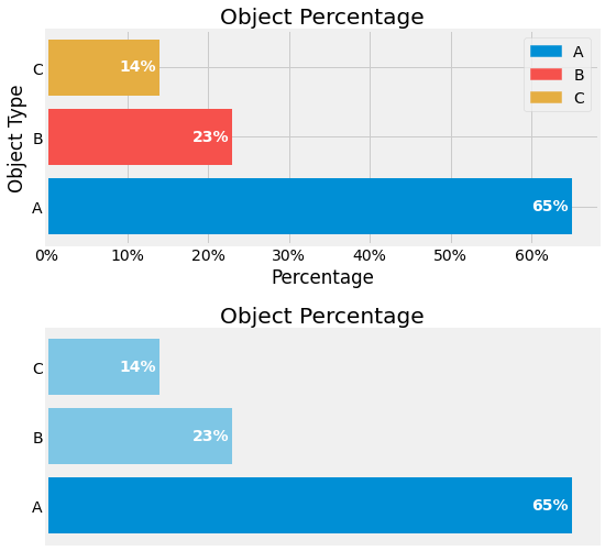
Fig. 2.3 Demonstration of Data-Ink Ratio, without on top figure and with on bottom figure.
2.3.2. Contextualization and Storytelling
The most powerful part of data visualization is Storytelling. Without, the visualization lacks impact. It is first essential to define a Context, the Audience, and the Nature of the data to create a connection between those two entities. Nevertheless, a big part of the interaction with the target is achieved through visuals. Aesthetics can be used to draw attention to certain parts of the graphic.