
3. Probabilities and Information Theory
3.1. Introduction
Probability Theory is the study of probability and its interpretations through a set of rigorous mathematical formalism and axioms. It defines probability in terms of a probability space and probability measures between \(0\) and \(1\). In conjunction with Linear Algebra, Probability is one of the bases for Machine Learning.
3.2. Fundamentals of Probability
In this section, the fundamental concepts of probability theory, Random Experiments, Sets, Indepedence, Conditional Probability, and Baye’s Rule are discussed.
3.2.1. Random Experiments
The Probability of an Event , defined as the chance of its realization, is encoded as a Positive Real Numeral between \(0\) and \(1\). Formally speaking, we first define a Probability Space composed of the three following components: a Sample Space \(\Omega\) representing all possible outcomes of an experiment, a set of possible Events, as well as a Probability Function \(P\) measuring the chance of each event to occur.
Note
Note the \(\Omega\) contains itself but also the empty set of events \(\varnothing\).
The probability function is defined such as it always respect the following requirements:
\(P(\varnothing)=0\)
\(P(\Omega)=1\)
\(P(A \cup B)=P(A) + P(B)\) for two disjoint events \(A\) and \(B\)
\(P(\overline{A}) = 1 - P(A)\) with \(\overline{A}\) being the complement of the event \(A\).
Let us illustrate those concepts by comparing three random experiments by Monte Carlo Simulation in conjunction with the Theroy.
3.2.1.1. Rowling Dices
Consider the following experiment where two independant and non-pipped six-sided dices are rolled, and we want to find the probability of the both dice being odd. The problem can be formalised as follow:
\(\Omega = \left \{ 1, \dots, 6 \right \}^2\)
\(A = \left \{ (i, j) \; | \; i + j \; \text{is odd} \right \}\)
\(P(B) = \frac{|B|}{|\Omega|}\) where \(|.|\) denotes the number of element in the given set
The probability function is symmetric and can be resumed in the following table:
import matplotlib.pyplot as plt
plt.ion()
plt.style.use("fivethirtyeight")

omega = list(range(0, 6 + 1))
table = [[i + j for j in omega] for i in omega]
color = [[(1, 1, 1, 1) if e % 2 == 0 else (0, 0.2, 0.2, 0.2) for e in row] for row in table]
table = [[str(e) for e in row] for row in table]

bold = lambda x: f"$\\bf{x}$"

for i in range(0, 6 + 1):
    color[i][0] = color[0][i] = (1, 1, 1, 1)
    table[i][0] = table[0][i] = bold(i) if i > 0 else ""

cell_size = 0.3
size = cell_size * len(table)

fig = plt.figure(figsize=(size, size),  facecolor="white")
ax = fig.add_subplot(1, 1, 1)
ax.set_axis_off()

table = ax.table(cellText=table, cellColours=color, loc="center", cellLoc="center")
table.set_fontsize(16)
for pos, cell in table.get_celld().items():
    cell.set_height(cell_size)
    cell.set_width(cell_size)

fig.canvas.draw()
Fig. 3.1 Table representig the probabilities for each value of the two dices. The odd outcomes’cell are filled in gray.
Using the defined probability function, we can now compute the probability of the event \(A\) as beign:
from itertools import product

import numpy as np
np.random.seed(42)


N, FACES = int(1e4), list(range(1, 6 + 1))
is_odd = lambda x: x % 2 != 0

th_p = np.sum([is_odd(i + j) for i, j in product(FACES, FACES)]) / (len(FACES) ** 2)
mc_p = np.sum([is_odd(np.random.choice(FACES) + np.random.choice(FACES)) for _ in range(N)]) / N

print(f"Theory                : P(A) = {th_p * 100:.2f}%")
print(f"Monte Carlo Estimation: P(A) = {mc_p * 100:.2f}%")
Theory                : P(A) = 50.00%
Monte Carlo Estimation: P(A) = 50.32%
3.2.1.2. Birthday Paradox
Consider a room full of people. If we ask the following question: What is the probability of having pairs of people with the same birthday date without the year? It is certain that with 366 people, you will have at least one pair. But what if we have fewer people? With 50 people, there is 97% chance for the existence of such a pair. This problem is referred to as the birthday paradox.
Let us formalized this problem as follow:
\(\Omega=\left \{ (x_i, x_j) \; \text{with} \; x_i, x_j \in \left \{ 1, \dots, 365 \right \} \right \}\), \(|\Omega| = 365^n\)
\(A = \left \{ (x_i, x_j) \; \text{whre} \; x_i=x_j \right \}\)
Let us considere \(\overline{A}\) which consists of all the tuples where \(x_i \neq x_j\).
As \(\overline{A}\) is the complement for \(A\):
In this sense, if we take a room of 50 people \(P(A) \approx 97.04\%\).
import numpy as np
np.random.seed(42)


N = int(1e2)

factorial = lambda n: 1 if n == 0 else n * factorial(n - 1)
factorials = [factorial(i) for i in range(366)]

days = lambda n: np.random.randint(1, 365 + 1, size=n)
same = lambda a: np.max(np.unique(a, return_counts=True)[1]) > 1

theo = lambda n: 1 - (factorials[365] / (factorials[365 - n] * (365 ** n)))
simu = lambda n: np.sum([same(days(n)) for _ in range(N)]) / N

ns = list(range(60 + 1))
th_ps = np.array([0 if n == 0 else theo(n) for n in ns])
mc_ps = np.array([0 if n == 0 else simu(n) for n in ns])

total_error = np.abs(th_ps - mc_ps).mean()
print(f"Theory vs Monte Carlo Simulation Mean Absolute Error: {total_error:.2f}")
Theory vs Monte Carlo Simulation Mean Absolute Error: 0.03
import matplotlib.pyplot as plt
plt.ion()
plt.style.use("fivethirtyeight")

fig = plt.figure(figsize=(4, 4),  facecolor="white")
ax = fig.add_subplot(1, 1, 1)

line, *_ = ax.plot(th_ps)
scat = ax.scatter(range(len(mc_ps)), mc_ps, color="r")
ax.set_ylim(-0.2, 1.2)
ax.set_yticks(np.arange(0, 1.2, 0.2))
ax.set_xlabel("population")
ax.set_ylabel("P(birthday match)")
ax.legend(handles=[line, scat], labels=["Theory", "Monte Carlo"])

fig.canvas.draw()
Fig. 3.2 Probability of a matching birthday in a room of n people.
3.2.2. Sets
Sets are playing a big part in the field of probability. In this regard, it is natural to discuss the Intersection, the Union, and Difference of sets.
If we consider \(A\) and \(B\) two subsets of some \(\Omega\), we denote:
\(A \cap B\) the intersection of \(A\) and \(B\)
\(A \cup B\) the union of \(A\) and \(B\)
\(A \setminus B\) the difference of \(A\) and \(B\)
\(\overline{A} = \Omega \setminus A\) the complement for \(A\)
The probability of the union is defined as follow:
The intersection of two disjoint event is:
import descartes
import matplotlib.pyplot as plt
import shapely.geometry as sg
plt.ion()
plt.style.use("fivethirtyeight")

a = sg.Point(-0.5, 0.0).buffer(1.)
b = sg.Point( 0.5, 0.0).buffer(1.)
c = sg.Point( 0.0, 0.0).buffer(1.)

left   = a.difference(b)
right  = b.difference(a)
middle = a.intersection(b)

fig = plt.figure(figsize=(8, 8),  facecolor="white")
ax1, ax2, ax3, ax4 = [fig.add_subplot(2, 2, i + 1) for i in range(4)]

ax1.add_artist(descartes.PolygonPatch(left,   fc=(0, 0, 0, 0.0), ec="k", lw=2))
ax1.add_artist(descartes.PolygonPatch(right,  fc=(0, 0, 0, 0.0), ec="k", lw=2))
ax1.add_artist(descartes.PolygonPatch(middle, fc=(0, 0, 0, 0.2), ec="k", lw=2))
ax1.add_artist(
    plt.Rectangle((-2, -2), width=4, height=4, facecolor=(0, 0, 0, 0), edgecolor="k", lw=4)
)
ax1.set_xlim(-2, 2)
ax1.set_ylim(-2, 2)
ax1.set_axis_off()
ax1.title.set_text("$A \cap B$")

ax2.add_artist(descartes.PolygonPatch(left,   fc=(0, 0, 0, 0.2), ec="k", lw=2))
ax2.add_artist(descartes.PolygonPatch(right,  fc=(0, 0, 0, 0.2), ec="k", lw=2))
ax2.add_artist(descartes.PolygonPatch(middle, fc=(0, 0, 0, 0.2), ec="k", lw=2))
ax2.add_artist(
    plt.Rectangle((-2, -2), width=4, height=4, facecolor=(0, 0, 0, 0), edgecolor="k", lw=4)
)
ax2.set_xlim(-2, 2)
ax2.set_ylim(-2, 2)
ax2.set_axis_off()
ax2.title.set_text("$A \cup B$")

ax3.add_artist(descartes.PolygonPatch(left,   fc=(0, 0, 0, 0.2), ec="k", lw=2))
ax3.add_artist(descartes.PolygonPatch(right,  fc=(0, 0, 0, 0.0), ec="k", lw=2))
ax3.add_artist(descartes.PolygonPatch(middle, fc=(0, 0, 0, 0.0), ec="k", lw=2))
ax3.add_artist(
    plt.Rectangle((-2, -2), width=4, height=4, facecolor=(0, 0, 0, 0), edgecolor="k", lw=4)
)
ax3.set_xlim(-2, 2)
ax3.set_ylim(-2, 2)
ax3.set_axis_off()
ax3.title.set_text("$A$ \\ $B$")

ax4.add_artist(
    plt.Rectangle((-2, -2), width=4, height=4, facecolor=(0, 0, 0, 0.2), edgecolor="k", lw=4)
)
ax4.add_artist(descartes.PolygonPatch(c, fc=(1, 1, 1, 1.0), ec="k", lw=2))
ax4.set_xlim(-2, 2)
ax4.set_ylim(-2, 2)
ax4.set_axis_off()
ax4.title.set_text("$\Omega$ \\ $A$")

fig.subplots_adjust(hspace=0.25, wspace=0.25)
fig.canvas.draw()
Fig. 3.3 Intersection, Union, Difference, and Complement of \(A\) and \(B\) from \(\Omega\).
3.2.2.1. Rushed Enveloppes
Consider a secretary dealing with letters and envelopes. In each of the \(n\) envelope correspond to one letter. Now let us imagine the secretary in a rush and place each letter in a random envelope. The probability of each letter going into the correct envelope is \(\frac{1}{n!}\). But what about the probability of all letters going into the wrong one?
Let us denote \(A_i\) the event of having the \(i\)-th letter in the correct envelope.
import descartes
import matplotlib.pyplot as plt
import shapely.geometry as sg
plt.ion()
plt.style.use("fivethirtyeight")

a = sg.Point(-0.5, -0.5).buffer(1.)
b = sg.Point( 0.5, -0.5).buffer(1.)
c = sg.Point( 0.0,  0.5).buffer(1.)

mc = a.intersection(b).intersection(c)
ml = c.intersection(a).difference(b)
mr = c.intersection(b).difference(a)
mb = a.intersection(b).difference(c)

fig = plt.figure(figsize=(8, 4),  facecolor="white")
ax1, ax2 = [fig.add_subplot(1, 2, i + 1) for i in range(2)]

ax1.add_artist(descartes.PolygonPatch(a,  fc=(0.8, 0.8, 0.8, 1.0), ec="k", lw=2))
ax1.add_artist(descartes.PolygonPatch(b,  fc=(0.8, 0.8, 0.8, 1.0), ec="k", lw=2))
ax1.add_artist(descartes.PolygonPatch(c,  fc=(0.8, 0.8, 0.8, 1.0), ec="k", lw=2))
ax1.add_artist(descartes.PolygonPatch(mc, fc=(0.8, 0.8, 0.8, 1.0), ec="k", lw=2))
ax1.add_artist(descartes.PolygonPatch(ml, fc=(0.8, 0.8, 0.8, 1.0), ec="k", lw=2))
ax1.add_artist(descartes.PolygonPatch(mr, fc=(0.8, 0.8, 0.8, 1.0), ec="k", lw=2))
ax1.add_artist(descartes.PolygonPatch(mb, fc=(0.8, 0.8, 0.8, 1.0), ec="k", lw=2))
ax1.add_artist(
    plt.Rectangle((-2, -2), width=4, height=4, facecolor=(0, 0, 0, 0), edgecolor="k", lw=4)
)
ax1.set_xlim(-2, 2)
ax1.set_ylim(-2, 2)
ax1.set_axis_off()
ax1.title.set_text("$A \cup B \cup C$")

ax2.add_artist(descartes.PolygonPatch(a,  fc=(1.0, 1.0, 1.0, 1.0), ec="k", lw=2))
ax2.add_artist(descartes.PolygonPatch(b,  fc=(1.0, 1.0, 1.0, 1.0), ec="k", lw=2))
ax2.add_artist(descartes.PolygonPatch(c,  fc=(1.0, 1.0, 1.0, 1.0), ec="k", lw=2))
ax2.add_artist(descartes.PolygonPatch(mc, fc=(0.8, 0.8, 0.8, 1.0), ec="k", lw=2))
ax2.add_artist(descartes.PolygonPatch(ml, fc=(1.0, 1.0, 1.0, 1.0), ec="k", lw=2))
ax2.add_artist(descartes.PolygonPatch(mr, fc=(1.0, 1.0, 1.0, 1.0), ec="k", lw=2))
ax2.add_artist(descartes.PolygonPatch(mb, fc=(1.0, 1.0, 1.0, 1.0), ec="k", lw=2))
ax2.add_artist(
    plt.Rectangle((-2, -2), width=4, height=4, facecolor=(0, 0, 0, 0), edgecolor="k", lw=4)
)
ax2.set_xlim(-2, 2)
ax2.set_ylim(-2, 2)
ax2.set_axis_off()
ax2.title.set_text("$A \cap B \cap C$")

fig.subplots_adjust(hspace=0.25, wspace=0.25)
fig.canvas.draw()
from myst_nb import glue
glue("sets_venndiag_fig", fig, display=False)
Fig. 3.4 Venn Diargrams for \(A \cup B \cup C\) and \(A \cap B \cap C\).
The probability of having no letter in the correct enveloppe is then given by:
Note
Notice that \(lim \underset{n \rightarrow +\infty}{P(B)} = \frac{1}{e} \approx 0.2855\).
import numpy as np
np.random.seed(42)


N = int(10e2)

factorial = lambda n: 1 if n == 0 else n * factorial(n - 1)
factorials = [factorial(i) for i in range(60)]

rand = lambda n: np.array(sorted(range(n), key=lambda k: np.random.rand()))
expe = lambda n: (np.arange(n) == rand(n)).sum() == 0
simu = lambda n: np.sum([expe(n) for _ in range(N)]) / N
theo = lambda n: np.sum([((-1) ** i) / factorials[i] for i in range(n)])

ns = list(range(60 + 1))
th_ps = np.array([0 if n == 0 else theo(n) for n in ns])
mc_ps = np.array([0 if n == 0 else simu(n) for n in ns])

total_error = np.abs(th_ps - mc_ps).mean()
print(f"Theory vs Monte Carlo Simulation Mean Absolute Error: {total_error:.2f}")
Theory vs Monte Carlo Simulation Mean Absolute Error: 0.04
import matplotlib.pyplot as plt
plt.ion()
plt.style.use("fivethirtyeight")

fig = plt.figure(figsize=(4, 4),  facecolor="white")
ax = fig.add_subplot(1, 1, 1)

line, *_ = ax.plot(th_ps)
scat = ax.scatter(range(len(mc_ps)), mc_ps, color="r")
ax.set_ylim(-0.2, 1.2)
ax.set_yticks(np.arange(0, 1.2, 0.2))
ax.set_xlabel("envelope amount")
ax.set_ylabel("P(no match)")
ax.legend(handles=[line, scat], labels=["Theory", "Monte Carlo"])

fig.canvas.draw()
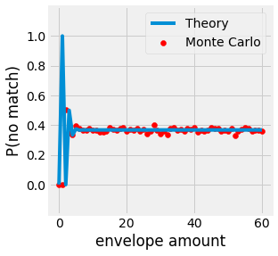
Fig. 3.5 Probability of no matching letter with a set of n envelopes.
3.2.3. Independence
Two events are considered Independent from each other when their intersection is the product of their probability.
Note
Be careful, Disjoint does not mean Independence.
Independence often occurs when the components of an experiment involve no interaction between them. It is the case for two flipping coins, for example. A direct implication of two events being independent is:
3.2.4. Conditional Probability
When dealing with experiments, it often happens to find that one event is dependant on another. This phenomenon is formalized by the name of Conditional Probability. \(A\) given \(B\) is written \(P(A | B)\) and is defined by:
Often rewrote as:
Note
If \(A\) and \(B\) are two Independent events, \(P(A | B) = P(A)\).
3.2.4.1. Law of Total Probability
One consequence of introducing the notion of conditional probability is the possibility to express the probability of a given event through conditional disjoint unions. This phenomenon is referred to as the Law of Total Probability:
import descartes
import matplotlib.pyplot as plt
import shapely.geometry as sg
plt.ion()
plt.style.use("fivethirtyeight")

fig = plt.figure(figsize=(4, 4),  facecolor="white")
ax = fig.add_subplot(1, 1, 1)

c = sg.Point(0, 0).buffer(1.5)

ax.add_artist(plt.Rectangle((-2, -2), width=2, height=1, facecolor=(0.2, 0.8, 0.8, 0.6), edgecolor="k", lw=2))
ax.add_artist(plt.Rectangle((-0, -2), width=2, height=3, facecolor=(0.8, 0.2, 0.8, 0.6), edgecolor="k", lw=2))
ax.add_artist(plt.Rectangle((-2,  0), width=2, height=3, facecolor=(0.8, 0.8, 0.2, 0.6), edgecolor="k", lw=2))
ax.add_artist(plt.Rectangle((-2, -1), width=2, height=1, facecolor=(0.2, 0.2, 0.8, 0.6), edgecolor="k", lw=2))
ax.add_artist(plt.Rectangle(( 0,  1), width=2, height=1, facecolor=(0.8, 0.2, 0.2, 0.6), edgecolor="k", lw=2))
ax.add_artist(plt.Rectangle((-2, -2), width=4, height=4, facecolor=(0.0, 0.0, 0.0, 0.0), edgecolor="k", lw=4))
ax.add_artist(descartes.PolygonPatch(c, fc=(1.0, 1.0, 1.0, 0.4), ec="k", lw=2))
ax.set_xlim(-2, 2)
ax.set_ylim(-2, 2)
ax.set_axis_off()

fig.canvas.draw()
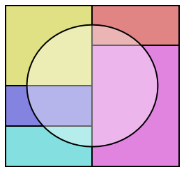
Fig. 3.6 Visualization of disjoint partitions \(B_i\) of \(\Omega\) in color and event \(A\) represented by a circle.
3.2.5. Baye’s Theorem
The Baye’s Theorem also called Baye’s Rule is a reformulation of the conditional probability definition:
The rewriting of the formula is quite easy but powerful. It says that we can express a posterior probability \(P(H | e)\), the probability of hypothesis \(H\) given the:
observed evidence \(e\), using our prior knowledge on the hypothesis before observation \(P(H)\)
likelihood of the evidence given our hypothesis is true
marginal probability \(P(e)\), how probable is the new evidence under all possible hypotheses
import pygraphviz as pgv
from IPython.display import Image


graph = """digraph probability_tree {
    node [shape=circle]
    O  [label="O"]
    A  [label="A1"]
    B  [label="B1"]
    AA [label="A2"]
    AB [label="B2"]
    BA [label="A2"]
    BB [label="B2"]
    O -> A  [label="P(A1)"]
    O -> B  [label="P(B1)"]
    A -> AA [label="P(A2 | A1)"]
    A -> AB [label="P(B2 | A1)"]
    B -> BA [label="P(A2 | B1)"]
    B -> BB [label="P(B2 | B1)"]
    node [shape=rectangle]
    AA -> "P(A1 n A2)"
    AB -> "P(A1 n B2)"
    BA -> "P(B1 n A2)"
    BB -> "P(B1 n B2)"
}"""

img = Image(pgv.AGraph(graph).draw(format='png', prog='dot'))
img
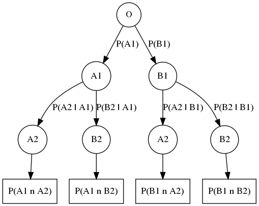
Fig. 3.7 Probability Tree, a node represent an outcome \(A\), or \(B\) and edges represent the probability of the \(i\)-th event given the event \(i-1\) actualy happened. Multiplication of a branch path defines the Baye’s Theorem \(P(A_2[A_1) = P(A_1 \cap A_2) P(A_1)\). Addition of the branches on a same level defines the total sum of probability \(P(A_2 | A_1) + P(B_2 | A_1) + (A_2 | B_1) + P(B_2 | B_1) = 1\).
3.2.5.1. Radio Transmission
Consider the example of a radio signal sent from the ISS to earth. Let say the bits transmitted are \(1\) 75% else \(0\). It is logical to consider the fact that the transmitted signal can be altered, distorted through physical phenomena. Let us denote \(\epsilon_0\) the chance of receiving a \(1\) instead of a \(0\), and \(\epsilon_1\) the chance or receiving a \(0\) instead of a \(1\).
Suppose you received a bit \(R\) as a 1. What is the probability that it was, in fact, transmitted \(T\) as 1? We can obtain the response by applying Baye’s Rule:
import numpy as np


N = int(10e4)

prior = 0.75
eps_0, eps_1 = 0.2, 0.1

flip = lambda bit: bit ^ 1 if np.random.rand() < (eps_1 if bit else eps_0) else bit

T_bits = (np.random.rand(N) < prior).astype(int)
R_bits = np.array([flip(bit) for bit in T_bits])

ones = R_bits == 1
ones_count = ones.sum()

mc_p = (T_bits[ones] == 1).sum() / ones_count
th_p = prior * (1 - eps_1) / (prior * (1 - eps_1) + (1 - prior) * eps_0)

print(f"Theory              : P(T=1 | R=1) = {th_p}")
print(f"Monte Carlo Estimate: P(T=1 | R=1) = {mc_p}")
Theory              : P(T=1 | R=1) = 0.9310344827586207
Monte Carlo Estimate: P(T=1 | R=1) = 0.9311757589089309
3.3. Random Variables and Distributions
Now that we have a sense of what probability is, it is time to introduce the notion of Random Variables and the various probability Distributions.
3.3.1. Random Variables
In probability, the numerical values involved in a random experiment are called Random Variable. The random variable \(X\) is a function of the sample space \(\Omega\) that represents some outcome \(X(\omega)\) for a given outcome \(\omega\). The Probability Distribution of the random variable \(X\) is represented by the function:
Random Variables can take different forms and can be either discrete or continuous depending on the problem’s nature. Let us consider an example for each of those two types.
3.3.1.1. Discrete Random Variable
Consider a bag containing a defined number of balls of different colors. Let now define \(X:\Omega \rightarrow \mathbb{Z}\), the discrete random variable counting the number of occurrences of one color for each ball. Each ball has the same chance of being picked. In this case, the probability distribution can be represented using a Probability Mass Function (PMF) \(p\) where:
The PMF always respect the following:
3.3.1.2. Continuous Random Variable
In continuous space, random variable are often represented with continuous random variables. In this case, the PMF does not hold any more, \(p(x)=0\) for every given \(x\). We then talk about Probability Density Function (PDF) p(x):
The PDF always respect the following:
import matplotlib.pyplot as plt
import numpy as np
plt.ion()
plt.style.use("fivethirtyeight")
np.random.seed(42)

fig = plt.figure(figsize=(8, 4),  facecolor="white")
ax1, ax2 = [fig.add_subplot(1, 2, i + 1) for i in range(2)]

n = 5
probas = np.exp(np.random.uniform(0, 5, size=n))
probas = probas / probas.sum()

ax1.bar(range(n), probas)
ax1.set_ylim(0, 1)
ax1.set_xticks(range(0, 4 + 1))
ax1.title.set_text("Discrete (PMF)")
ax1.set_xlabel("x")
ax1.set_ylabel("probability")

bell = lambda x, m, s: (1 / (s * np.sqrt(2 * np.pi))) * np.exp(-0.5 * ((x - m) / s) ** 2)
X = np.linspace(0, 4, num=100)
Y = bell(X, 2, 0.5)

ax2.plot(X, Y)
ax2.fill_between(X, np.zeros_like(Y), Y, alpha=0.2)
ax2.set_ylim(0, 1)
ax2.set_xticks(range(0, 4 + 1))
ax2.title.set_text("Continuous (PDF)")
ax2.set_xlabel("x")
ax2.set_ylabel("density")

fig.subplots_adjust(hspace=0.25, wspace=0.40)
fig.canvas.draw()
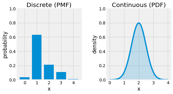
Fig. 3.8 PMF of a random discrete variable left, and PDF of a random continuous variable right.
3.3.2. Sum Rule
Consider a set of random variables. If we want to compute the probability distribution over a subset of them, the Marginal Probability Distrubution, it is possible to do so using the Sum Rule. Let us consider \(X\) and \(Y\), two random variables. We only know \(P(X, Y)\) and we want to compute \(P(X)\):
Note
The low of total probability connects the marginal probabilities with conditional probabilities.
The name of Marginal Probability comes from its computation using a probability table on paper, as the following example illustrates with the voting for a woman president displayed by voter’s gender:
import matplotlib.pyplot as plt
plt.ion()
plt.style.use("fivethirtyeight")

bold = lambda x: f"$\\bf{x}$"
table = [
    [            "",  bold("Yes"), bold("No"), bold("Total")],
    [bold("Female"),       "0.41",     "0.07",        "0.48"],
    [bold("Male"  ),       "0.47",     "0.05",        "0.52"],
    [bold("Total" ),       "0.88",     "0.12",        "1.00"],
]

n = len(table)
color = [[(1, 1, 1) for j in range(n)] for i in range(n)]
for i in [1, 2]:
    color[n - 1][i] = color[i][n - 1] = (0.0, 0.2, 0.2, 0.2)

cell_size = 0.5
size = cell_size * n

fig = plt.figure(figsize=(size, size),  facecolor="white")
ax = fig.add_subplot(1, 1, 1)
ax.set_axis_off()

table = ax.table(cellText=table, cellColours=color, loc="center", cellLoc="center")
table.set_fontsize(16)
for pos, cell in table.get_celld().items():
    cell.set_height(cell_size)
    cell.set_width(cell_size)

fig.canvas.draw()
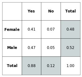
Fig. 3.9 Vote for Woman President by Gender. The marginal probabilities are represented in the margin of the table corresponding to the “Total” column and row.
3.3.3. Product Rule
Consider a joint probability distribution over multiple random variables. It may be decomposed as a product of conditional distributions over one variable. This decomposition is called the Product Rule or Chain Rule and is the following:
Let us consider an example with four random variables:
3.3.4. Expectation, Variance, and Covariance
Probability theory comes with various metrics for representing and studying the variation of distributions such as the Expectation, Variance, Standard Deviation, and the Covariance for example.
The Expectation of any function \(f\) in respect to a random variable \(X\), \(\mathbb{E}(x)\), is its weighted average over the dostribution \(P(X)\):
Note
\(X \sim P\) is often omitted when explicit.
The Expectation has the particularity to be a linear function:
The Variance gives informations about the variation of a function over a random variable and is given by:
A low variance implies that each sample of the distribution is close to its expected value. We define the Standard Deviation as the square root of the variance.
The Covariance allow to express in which way and how much linearly related are two values over a random variable sampled from a given distribution:
Note
When the two random variables are independent, their covariance is null.
We can then define the Covariance Matrix of a random \(n\)-dimensional vector \(x\) as a square matrix of size \(n\) where:
As \(Cov(f(X), f(X))=Var(f(X))\), the diagonal of the covatiant matrix gives the variance of the variable \(x_i\).
3.3.5. Distribution Zoo
Multiple distributions have been defined and studied over the years, depending on their context. In this section, we list some of them and their descriptors. Some details are omitted for the sake of compactness.
3.3.5.1. Discrete Distributions
Uniform \(U(a, b)\)
The Uniform distirbution gives the same probability for every sample of the probability space it is defined on:
Its expected value and variance are:
Bernoulli \(B(p)\)
The Bernoulli distribution is defined for a binary random variable to which a value of \(1\) is given with probability \(p\) and \(0\) with probability \((1 - p)\):
Its expected value and variance are:
Binomial \(B(n, p)\)
The Binomial is defined as a \(n\) simultaneous trials of independent Bernoulli experiment with \(k\) the number of successful trials:
Its expected value and variance are:
Poisson \(Pois(\lambda)\)
The Poisson distribution can be used for modeling occurences of events over time or space with \(k\) the number of occurrences and \(\lambda\) the rate of occurrence:
Its expected value and variance are:
import matplotlib.pyplot as plt
import numpy as np
import seaborn as sns
plt.ion()
plt.style.use("fivethirtyeight")
np.random.seed(42)

N = int(1e3)

fig = plt.figure(figsize=(20, 4),  facecolor="white")
ax1, ax2, ax3, ax4 = [fig.add_subplot(1, 5, i + 1) for i in range(4)]

sns.histplot(np.random.uniform(0, 4, size=N), ax=ax1, stat="probability", discrete=True)
ax1.title.set_text("U(0, 4)")
ax1.set_xlabel("X")
ax1.set_ylabel("probability")
ax1.set_xticks(range(0, 4 + 1))
ax1.set_ylim(0, 1)
ax1.grid(axis='x')

sns.histplot(np.random.binomial(n=1, p=0.5, size=N), ax=ax2, stat="probability", discrete=True)
ax2.title.set_text("B(p=0.5)")
ax2.set_xlabel("X")
ax2.set_ylabel("probability")
ax2.set_xticks(range(0, 1 + 1))
ax2.set_ylim(0, 1)
ax2.grid(axis='x')

sns.histplot(np.random.binomial(n=4, p=0.5, size=N), ax=ax3, stat="probability", discrete=True)
ax3.title.set_text("B(n=4, p=0.5)")
ax3.set_xlabel("X")
ax3.set_ylabel("probability")
ax3.set_xticks(range(0, 4 + 1))
ax3.set_ylim(0, 1)
ax3.grid(axis='x')

sns.histplot(np.random.poisson(lam=1.2, size=N), ax=ax4, stat="probability", discrete=True)
ax4.title.set_text("Pois($\\lambda$=1.2)")
ax4.set_xlabel("X")
ax4.set_ylabel("probability")
ax4.set_ylim(0, 1)
ax4.grid(axis='x')

fig.subplots_adjust(hspace=0.25, wspace=0.40)
fig.canvas.draw()
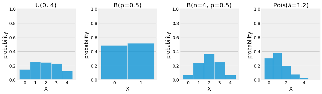
Fig. 3.10 Visualization of the discrete Uniform, Bernoulli, Binomial, and Poisson distributions using Monte Carlo Simulation.
3.3.5.2. Continuous Distributions
Normal (Gaussian) \(\mathcal{N}(\mu, \sigma^2)\)
The Normal, Gaussian, or Laplce-Gaussian distribution is continuous and one of the most used distributions to model natural phenomas such as white noise and brownien movement. It is parametrized by a mean \(\mu\) and a standard deviation \(\sigma\) and looks like a Bell curve:
Its expected value and variance are:
Gamma \(\Gamma(k, \theta)\)
The Gamma distribution is a family of continuous distribution (\(\chi^2\) and exponential distribution) used for modeling natural temporal phenomenas sucha as Lifespan Analysis and is parametrized by two parameters, the scale \(k\), and the intensity \(\theta\):
Its expected value and variance are:
Beta \(Beta(\alpha, \beta)\)
The Beta distribution, generalize to multiple variables with the name Dirichlet distribution, is a continuous distribution used to model random behaviours of percentages and distributions, and especially in Bayesian Inference for modeling the conjugate prior probability of the Brenoulli, Binomial and other distributions. It is paremtrized by two positive values, \(\alpha\) and \(\beta\):
Its expected value and variance are:
import matplotlib.pyplot as plt
import numpy as np
import seaborn as sns
plt.ion()
plt.style.use("fivethirtyeight")
np.random.seed(42)

N = int(1e4)

fig = plt.figure(figsize=(12, 4),  facecolor="white")
ax1, ax2, ax3 = [fig.add_subplot(1, 3, i + 1) for i in range(3)]

sns.distplot(np.random.normal( 0, 1.0, size=N), ax=ax1, kde=True, norm_hist=True)
sns.distplot(np.random.normal( 0, 0.5, size=N), ax=ax1, kde=True, norm_hist=True)
sns.distplot(np.random.normal( 0, 5.0, size=N), ax=ax1, kde=True, norm_hist=True)
sns.distplot(np.random.normal(-2, 1.0, size=N), ax=ax1, kde=True, norm_hist=True)
ax1.title.set_text("$\\mathcal{N}(\\mu, \\sigma^2)$")
ax1.set_xlabel("X")
ax1.set_ylabel("probability")
ax1.set_xlim(-4, 4)
ax1.set_ylim(0, 1)
ax1.grid(axis='x')
ax1.legend(labels=[
    "$\\mathcal{N}$(0, 1.0)",
    "$\\mathcal{N}$(0, 0.2)",
    "$\\mathcal{N}$(0, 5.0)",
    "$\\mathcal{N}$(-2, 1.0)",
])

sns.distplot(np.random.gamma(1, 2.0, size=N), ax=ax2, kde=True, norm_hist=True)
sns.distplot(np.random.gamma(9, 0.5, size=N), ax=ax2, kde=True, norm_hist=True)
sns.distplot(np.random.gamma(3, 2.0, size=N), ax=ax2, kde=True, norm_hist=True)
sns.distplot(np.random.gamma(2, 2.0, size=N), ax=ax2, kde=True, norm_hist=True)
ax2.title.set_text("$\Gamma(k, \\theta)$")
ax2.set_xlabel("X")
ax2.set_ylabel("probability")
ax2.set_xlim(0, 20)
ax2.set_ylim(0, 1)
ax2.grid(axis='x')
ax2.legend(labels=[
    "$\Gamma$(1, 2.0)",
    "$\Gamma$(9, 0.5)",
    "$\Gamma$(3, 2.0)",
    "$\Gamma$(2, 2.0)",
])

sns.distplot(np.random.beta(0.5, 0.5, size=N), ax=ax3, kde=True, norm_hist=True)
sns.distplot(np.random.beta(2.0, 2.0, size=N), ax=ax3, kde=True, norm_hist=True)
sns.distplot(np.random.beta(2.0, 5.0, size=N), ax=ax3, kde=True, norm_hist=True)
sns.distplot(np.random.beta(5.0, 1.0, size=N), ax=ax3, kde=True, norm_hist=True)
ax3.title.set_text("Beta$(\\alpha, \\beta)$")
ax3.set_xlabel("X")
ax3.set_ylabel("probability")
ax3.set_xlim(0, 1)
ax3.set_ylim(0, 4)
ax3.grid(axis='x')
ax3.legend(labels=[
    "Beta(0.5, 0.5)",
    "Beta(2, 2)",
    "Beta(2, 5)",
    "Beta(5, 1)",
])

fig.subplots_adjust(hspace=0.25, wspace=0.40)
fig.canvas.draw()
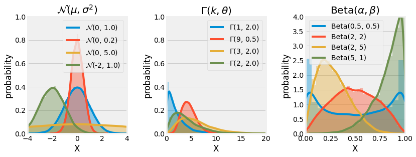
Fig. 3.11 Visualization of the continuous Normal, Gamma, and Beta distributions using Monte Carlo Simulation.
3.3.5.3. Mixture of Distributions
It is also common to define some probability distributions as a Mixture of different known distributions. It is interesting in the sense that some properties are conserved.
Note
from mpl_toolkits.axes_grid1 import make_axes_locatable
from scipy.stats import multivariate_normal

import matplotlib.pyplot as plt
import numpy as np
plt.ion()
plt.style.use("fivethirtyeight")
np.random.seed(42)

N = int(1e4)

fig = plt.figure(figsize=(12, 4),  facecolor="white")
ax1 = fig.add_subplot(1, 2, 1)
ax2 = fig.add_subplot(1, 2, 2)

params1 = -1.0, 1.0
params2 =  1.5, 0.5
t = 0.5

mix = lambda a, b, t: t * a + (1 - t) * b
gauss = lambda x, mu, sig: 1 / (sig * np.sqrt(2 * np.pi)) * np.exp(-0.5 * ((x - mu) / sig) ** 2)
gauss_mixture = lambda x, params1, params2, t: mix(gauss(x, *params1), gauss(x, *params2), t)

X = np.linspace(-4, 4, 100)
Y = gauss_mixture(X, params1, params2, t)
ax1.plot(X, Y)
ax1.fill_between(X, Y, alpha=0.2)
ax1.set_xlim(-4, 4)
ax1.set_ylim(0, 0.6)
ax1.set_xlabel("x")
ax1.set_ylabel("p(x)")
ax1.title.set_text("1D Gaussian Mixture")
ax1.set_xticks(list(range(-4, 4 + 1))[::2])

X, Y = np.mgrid[-4:4:0.1, -4:4:0.1]
XY = np.column_stack([X.flat, Y.flat])
Z = mix(
    multivariate_normal.pdf(XY, mean=[params1[0]] * 2, cov=np.diag([params1[1]] * 2)),
    multivariate_normal.pdf(XY, mean=[params2[0]] * 2, cov=np.diag([params2[1]] * 2)),
    t,
).reshape(X.shape)
img = ax2.imshow(Z, extent=[-4, 4, -4, 4])
ax2.title.set_text("2D Gaussian Mixture")
ax2.set_yticks(np.arange(-4, 4 + 1, 2))
ax2.grid()
ax2.set_xlabel("X")
ax2.set_ylabel("Y")

divider = make_axes_locatable(ax2)
cax = divider.new_horizontal(size="5%", pad=0.4, pack_start=False)
fig.add_axes(cax)
fig.colorbar(img, cax=cax, label="p(x, y)")

fig.canvas.draw()
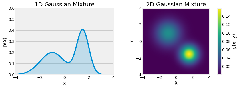
Fig. 3.12 Gaussian Mixtures, univariate left and multivariate right, \(X \sim \frac{1}{2} \mathcal{N(-1, 1)} + \frac{1}{2} \mathcal{N(1.5, 0.5)}\).
3.4. Information Theory
Information Theory is a subfield of applied mathematics introduced by Claude Shannon, which studies the quantification, storage, and communication of information. This section discusses information theory to allow probability distributions’ characterization and introduce similarity metrics between two distributions.
3.4.1. Self-Information and Entropy
The basis for information theory is to understand that there is more information about what is less likely to occur than what is obvious. There is less information in the message “The Moon rose tonight.” than in the message “There is a moon eclipse tonight.”. Shannon formalized this idea of quantizing information, and the underlying intuitions are the following:
There should be zero to low information content attributed to more likely events
There should be higher information content attributed to less likely events
There should be additive information content for independent events
Self-Information has been designed to follow those guidelines. Consider an event \(X = x\):
Note
In this section \(log\) refers to the natural logarithm \(ln\) of base \(e\). In this sense, the measure of information is defined in nats, where \(1 nat\) corresponds to the information gained observing an event with probability \(\frac{1}{2}\). The Information measure is also defined in base \(2\) logarithm and is called \(bits\) or \(shannons\) but implies unnecessary constants in some computations.
The self-information metric is defined only for a single outcome, and the amount of uncertainty within an entire probability distribution can be measure using the Shannon Entropy:
It gives us information about the average amount needed to encode all the symbols from such a distribution. As defined above, distributions close to deterministic have a low entropy, and distributions close to uniform have high entropy.
Let us consider a Bernoulli trial and plot its entropy function.
import matplotlib.pyplot as plt
import numpy as np
plt.ion()
plt.style.use("fivethirtyeight")
np.random.seed(42)

fig = plt.figure(figsize=(4, 4),  facecolor="white")
ax = fig.add_subplot(1, 1, 1)

P = np.linspace(1e-4, 1 - 1e-4, 100)
H = -P * np.log2(P) - (1 - P) * np.log2(1 - P)

P = np.concatenate([[0], P, [1]])
H = np.concatenate([[0], H, [0]])

ax.plot(P, H)
ax.set_ylabel("H(X)")
ax.set_xlabel("p")
ax.set_xticks([0, 0.5, 1])

fig.canvas.draw()
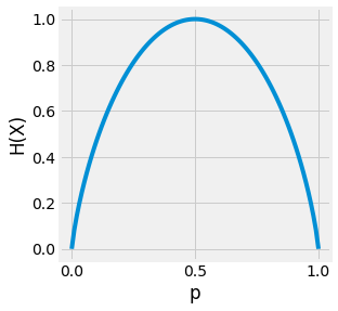
Fig. 3.13 Visualization of the entropy of a Bernoulli trial depending on the value attributed to \(p = P(X=1)\). If the outcome is abvious the entropy is low. But if the outcome is uncertain, the entropy is high.
3.4.2. Kullback-Leibler Divergence
Another great tool defined by the information theory is the notion of similarity between two distribution. If we consider two distributions \(P\) and \(Q\) over the same random variable \(X\), it is possible to measure their difference using the Kullback-Leibler Divergence, or KL-Divergence for short:
Becareful, the KL-Divergence can be assimilated to a measure but is not. It is a non-symetric measure, \(D_{KL}(P \| Q) \neq D_{KL}(Q \| P)\). Its value is always non-negative \(D_{KL}(P \| Q) \geq 0\), and \(D_{KL}(P \| Q) = 0\) if and only if \(P=Q\).
from scipy.stats import norm

import matplotlib.pyplot as plt
import numpy as np
plt.ion()
plt.style.use("fivethirtyeight")
np.random.seed(42)

fig = plt.figure(figsize=(8, 4),  facecolor="white")
ax1, ax2 = [fig.add_subplot(1, 2, i + 1) for i in range(2)]

X = np.linspace(-4, 4, 100)
P = norm(0, 1).pdf(X)
Q = norm(1, 1).pdf(X)

line1, *_ = ax1.plot(X, P)
line2, *_ = ax1.plot(X, Q)
ax1.set_ylabel("probability")
ax1.set_xlabel("X")
ax1.legend(handles=[line1, line2], labels=["p(x)", "q(x)"])

D_KL_P = P * np.log(P / Q)
D_KL_Q = Q * np.log(Q / P)

line1, *_ = ax2.plot(X, D_KL_P)
line2, *_ = ax2.plot(X, D_KL_Q)
ax2.fill_between(X, D_KL_P, alpha=0.2)
ax2.fill_between(X, D_KL_Q, alpha=0.2)
ax2.set_ylabel("$D_{KL}$")
ax2.set_xlabel("X")
ax2.legend(handles=[line1, line2], labels=["$D_{KL}(P||Q)$", "$D_{KL}(Q||P)$"], loc="upper left")

fig.subplots_adjust(hspace=0.25, wspace=0.40)
fig.canvas.draw()
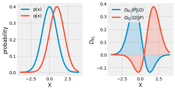
Fig. 3.14 Visualization of the KL-Divergence \(D_{KL}(P \| Q)\) between two gaussian distributions \(P\) and \(Q\).
3.4.3. Jensen-Shanon Divergence
Originally, Kullback and Leibler defined the divergence metric in a symmetric and non-negative manner:
An alternative to this formulation, the \(\lambda\) Divergence is:
When \(\lambda = \frac{1}{2}\), this metric is referred as the Jensen-Shannon Divergence \(D_{JS}\). It can be interpreted as the expected information gain from knowing from which distribution the random variable \(X\) is drawn from, \(P\) or \(Q\) with probability \(\lambda\) and \((1 - \lambda)\) respectively.
from scipy.stats import norm

import matplotlib.pyplot as plt
import numpy as np
plt.ion()
plt.style.use("fivethirtyeight")
np.random.seed(42)

fig = plt.figure(figsize=(8, 4),  facecolor="white")
ax1, ax2 = [fig.add_subplot(1, 2, i + 1) for i in range(2)]

X = np.linspace(-4, 4, 100)
P = norm(0, 1).pdf(X)
Q = norm(1, 1).pdf(X)

line1, *_ = ax1.plot(X, P)
line2, *_ = ax1.plot(X, Q)
ax1.set_ylabel("probability")
ax1.set_xlabel("X")
ax1.legend(handles=[line1, line2], labels=["p(x)", "q(x)"])

M = 0.5 * (P + Q)
D_JS = P * np.log(P / M) + Q * np.log(Q / M)

ax2.plot(X, D_JS)
ax2.fill_between(X, D_JS, alpha=0.2)
ax2.set_ylabel("$D_{JS}(P, Q)$")
ax2.set_xlabel("X")
ax2.set_ylim(-0.02, 0.42)

fig.subplots_adjust(hspace=0.25, wspace=0.40)
fig.canvas.draw()
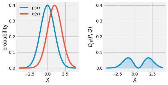
Fig. 3.15 Visualization of the Jensen-Shannon Divergence \(D_{KL}(P, Q)\) between two gaussian distributions \(P\) and \(Q\).
3.4.4. Wasserstein Distance
Weither it is the non-symetric KL-Divergence, or the Jensen-Shannon Divergence, both suffer from their domain of application. Imagine two distribution \(P\) and \(Q\) with no overlapp:
This one of the reasons we introduce the Wasserstein Distance, or Earth Mover’s Distance, as an alternative, a smoother distance for measuring probability distributions similarities. Its name comes from the fact that it can be interpreted as the minimum energy cost of moving and transforming a stack of dirt following a probability distribution into another one.
The Wasserstein Distance is given by:
Before running away from this monster equation, and explaining its terms, let us consider a simple example with two discrete probabilities \(P\) and \(Q\). Each of them has \(4\) piles of dirt with a total of \(10\) shovelfuls of dirt.
Let us design a optimal plan for turning P into Q:
Move 2 shovelfuls from \(P_1\) to \(P_2\) and \(P_1=Q_1\)
Move 2 shovelfuls from \(P_2\) to \(P_3\) and \(P_2=Q_2\)
Move 1 shovelfuls from \(Q_3\) to \(Q_4\) and \(P_3=Q_3,\;P_4=Q_4\)
If we define \(\delta_i\) the cost of turning \(P_i\) into \(Q_i\), \(\delta_{i+1}=\delta_i + P_i + Q_i\):
The Wasserstein Distance is then defined as \(W(P, Q) = \sum |\delta_i| = 5\).
import matplotlib.pyplot as plt
plt.ion()
plt.style.use("fivethirtyeight")

fig = plt.figure(figsize=(16, 8),  facecolor="white")
ax11, ax12, ax13, ax14, ax21, ax22, ax23, ax24 = [fig.add_subplot(2, 4, i + 1) for i in range(8)]

ax11.bar([f"$P_{i + 1}$" for i in range(4)], [3, 2, 1, 4], color="#008FD5")
ax12.bar([f"$P_{i + 1}$" for i in range(4)], [1, 4, 1, 4], color="#008FD5")
ax13.bar([f"$P_{i + 1}$" for i in range(4)], [1, 2, 3, 4], color="#008FD5")
ax14.bar([f"$P_{i + 1}$" for i in range(4)], [1, 2, 3, 4], color="#008FD5")

ax21.bar([f"$Q_{i + 1}$" for i in range(4)], [1, 2, 4, 3], color="#F6514C")
ax22.bar([f"$Q_{i + 1}$" for i in range(4)], [1, 2, 4, 3], color="#F6514C")
ax23.bar([f"$Q_{i + 1}$" for i in range(4)], [1, 2, 4, 3], color="#F6514C")
ax24.bar([f"$Q_{i + 1}$" for i in range(4)], [1, 2, 3, 4], color="#F6514C")

ax11.title.set_text(f"Step_{0}")
ax12.title.set_text(f"Step_{1}")
ax13.title.set_text(f"Step_{2}")
ax14.title.set_text(f"Step_{3}")

ax11.set_ylabel("# shovelfuls in P")
ax21.set_ylabel("# shovelfuls in Q")

fig.subplots_adjust(hspace=0.25, wspace=0.25)
fig.canvas.draw()
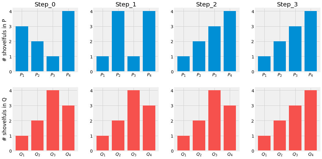
Fig. 3.16 Transport Plan from \(P\) to \(Q\). Visualization of the Wasserstein Distance \(W(P, Q)\).
Let us now come back on the continuous definition of the Wasserstein Distance:
Here, \(\Pi(p, q)\) represents the set of all joint probability distributions between \(p\) and \(q\). \(\gamma\) is one possible joint distribution describing a dirst transport plan. We can interpret \(\gamma(x, y)\) as the percentage of dirt we need to transport from \(x\) to \(y\) to make \(x\) following the same distribution as \(y\). The total amount of dirst moved is represented by this value and its traveling distance by \(\|x - y\|\). The cost of moving \(x\) to resemble \(y\) is thus defined as \(\gamma(x, y)\cdot\|x - y\|\). Finally the cost of the transport plan is the expected cost average for every \((x, y)\) pairs:
The Wasserstein Distance is finally the minimum cost among all possible transport plans \(\Pi(p, q)\).
from scipy.stats import norm
from scipy.stats import wasserstein_distance

import matplotlib.pyplot as plt
import numpy as np
plt.ion()
plt.style.use("fivethirtyeight")
np.random.seed(42)

fig = plt.figure(figsize=(8, 4),  facecolor="white")
ax1, ax2 = [fig.add_subplot(1, 2, i + 1) for i in range(2)]

X = np.linspace(-4, 4, 100)
P = norm(0, 1).pdf(X)
Q = norm(1, 1).pdf(X)

line1, *_ = ax1.plot(X, P)
line2, *_ = ax1.plot(X, Q)
ax1.set_ylabel("probability")
ax1.set_xlabel("X")
ax1.legend(handles=[line1, line2], labels=["p(x)", "q(x)"])

N = 10
M = [i * (1 - 0) / N for i in range(N + 1)]
W = [wasserstein_distance(X, X, norm(mu, 1).pdf(X), Q) for mu in M]

ax2.plot(M, W, color="#E5AE42")
ax2.set_ylabel("W(P, Q)")
ax2.set_xlabel("$\mu_{p}$")

fig.subplots_adjust(hspace=0.25, wspace=0.40)
fig.canvas.draw()
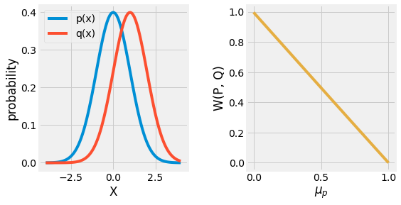
Fig. 3.17 Visualization of the Wasserstein Distance \(W(P, Q)\) between two gaussian distributions \(P\) and \(Q\). The distance is lowering towards \(0\) as the \(\mu\) of the \(P\) gaussian distribution moves towards the one of \(Q\).
3.4.5. Cross-Entropy
One last metric related to the KL-Divergence is the Cross-Entropy. It is defined as:
One thing to notice is that minimizing the cross-entropy with respect to \(Q\) is the same as minimizing the KL-Divergence as \(Q\) does not intervene in the first term. This metric is key to the Machine Learning field when dealing with classification.
3.5. Applications
3.5.1. Markov Chain
Realtime processes such as speech recognition, text classification, path recognition, and many more can be explained using Markov Chain. Markov Chain are based on the idea that the current state \(S_t\) of a process only depends on its previous state \(S_{t+1}\), it is Memoryless. This assumption allows the use of simple conditional probabilities and computations.
Note
The problem of Markov Chain is left to the student. Solutions are given by unhiding the corresponding code. As always, try to do it yourself before giving a glance at the answers. Try to make your brain actively recovering this entire chapter.
The problem of Eigenfaces is left to the student. Solutions are given by unhiding the corresponding code. As always, try to do it yourself before giving a glance at the answers. Try to make your brain actively recovering this entire chapter.
Let us considere two companies Apple \(A\) and Microsoft \(M\). A new companie wants to partner with one of those two and hire a market research company to find out which of the two brand will have a higher marker share after some period, let say 1 month. The actual state of both companies is respectively \(45%\) and \(55%\). The recrutted market research team comes up with the following conclusion:
The first information we gain from the study is that Apple’s users tend to stay faithful to Apple’s products. However, it currently has the lowest wallet share of the two companies.
import pygraphviz as pgv
from IPython.display import Image


graph = """digraph
{
    rankdir=TB;
    node [ shape = circle ];
    { rank = same; A M }

    A -> M[label="0.1"];
    M -> A[label="0.3"];

    edge[ dir = back ];
    A:ne -> A:nw[label="0.9"];
    M:ne -> M:nw[label="0.7"];
}"""

img = Image(pgv.AGraph(graph).draw(format='png', prog='dot'))
img
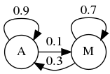
Fig. 3.18 Markov Chain for Apple and Microsoft Transitions.
3.5.1.1. Transition Matrix
The four transition statement can be organized into a transition diagram. It allow us to vsualize the transition and the market share of each company. We can compute the new share after a month using the following:
These calculation could be resumed in Matrix form:
Knowing the initial state and the transformation matrix associated with this markov chain, compute the evolution of both company’ states over time and visualize the result:
import numpy as np


# Initial State
S_init = np.array([
    [0.45, 0.55]
])

# Transition Matrix
P = np.array([
    [0.9, 0.1],
    [0.3, 0.7],
])

# States Computation
N = 20
states = np.zeros((N + 1, 2))
states[0] = S_init
for i in range(N):
    states[i + 1] = states[i] @ P

for t, S in enumerate(states[:10]):
    print(f"S_{t:02d}:", *[f"{s:.2f}" for s in S])
S_00: 0.45 0.55
S_01: 0.57 0.43
S_02: 0.64 0.36
S_03: 0.69 0.31
S_04: 0.71 0.29
S_05: 0.73 0.27
S_06: 0.74 0.26
S_07: 0.74 0.26
S_08: 0.74 0.26
S_09: 0.75 0.25
import matplotlib.pyplot as plt
import numpy as np
plt.ion()
plt.style.use("fivethirtyeight")

fig = plt.figure(figsize=(4, 4),  facecolor="white")
ax = fig.add_subplot(1, 1, 1)

states = np.array(states)
line1, *_ = ax.plot(range(N + 1), states[:, 0])
line2, *_ = ax.plot(range(N + 1), states[:, 1])
line3 = ax.axvline(9, color="k", linestyle="--")
ax.legend(handles=[line1, line2, line3], labels=["Apple", "Microsoft", "Steady State"])
ax.set_ylim(0, 1)

fig.canvas.draw()
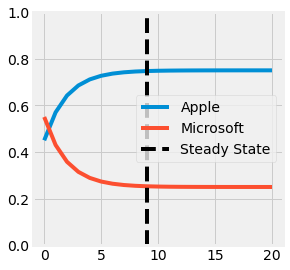
Fig. 3.19 Visualization of the States using the Markov Chain for Apple and Microsoft Transitions. The steady state is reached at the black dotted line.
3.5.1.2. Steady State
This transformation is called a Markov Chain. Furthermore, if the Transition Matrix \(P\) does not evolve, it allows us to compute for more than one month later. The tendency makes Microsoft’s shares decrease over time. Nevertheless, at some point, there will be as many new customers as leaving one. This state is referred to as the Steady State \(\pi\) and respects the following equation:
The steady-state of a transition matrix, if it exists, is a left eigenvector of \(P\), and can be computed following the next procedure:
Resolve this homogeneous equation using linear algebra and compare the result with those obtained empirically:
# Homogeneous Linear System of Equations
Q = P - np.eye(P.shape[0])
e = np.ones((P.shape[0], 1))

Qe = np.column_stack([Q, e])
b  = np.zeros((P.shape[0] + 1, 1))
b[-1, 0] = 1.0

# Solving using Least Squares
pi_T, *_ = np.linalg.lstsq(Qe.T, b, rcond=1)
print("Steady State:", *[f"{s:.2f}" for s in pi_T.T[0]])
Steady State: 0.75 0.25